
table of contents
Preface
When analyzing real estate market conditions, I sometimes see graphs of contract prices and the number of contracts for condominiums and detached houses.
I think it will be possible to unravel some cause from the visualized data transition and predict future trends (predictions are just predictions).
Since it is real estate, the basic principle is that there are no exactly the same properties.
However, I wondered if it was possible to make this graph a little more user-friendly.
1.Tables and graphs showing real estate market conditions
From the official website of the public interest corporation real estate distribution promotion centerDataI borrowed
I think it's a table format that you often see.
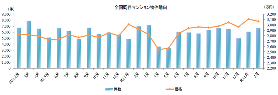
Here is a time series graph of the same object.
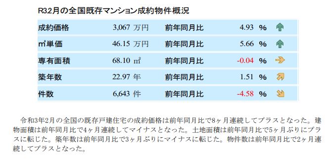
First of all, the contract price at the top of the table is 4.93% higher than the same month of the previous year, but the graph shows nothing.Since it has fallen compared to the previous month, it seems better to be careful that it does not necessarily reflect everything when compared with the same month of the previous year.
This time, the number of cases listed in the bottommost column of the table is -4.58% compared to the same month of the previous year, but the bar graph in the graph shows an increase compared to the previous month.
What stands out again is the two months of April and May of R2.Numbers and prices are plummeting.I think it was about two months after the state of emergency was declared, but compared to that, in January and February of 4, both the number of cases and prices were at the same level as before the new coronavirus infection, so these two months It is thought that this is evidence of how abnormal the situation was.
2. Volume analysis
So, I wondered if it would be possible to utilize the number of items listed in this graph in addition to the price.
It will be a site that explains stock investment.Such chart analysis can last a day, or even longer, in stock investing.
Real estate price graphs are alsoKakaku.com Investment/Asset Management, Volume 3 Analysis
Volume is the number of trades completed on a given day in the market.It is also said to be a popular barometer and is interpreted as leading stock prices, making it indispensable for technical analysis.It is important to note that trading volume will increase both when good news emerges and the stock is extremely popular, and when bad news emerges and investors sell off vigorously.
Volume analysis
In a nutshell, an increase in volume in an uptrend is bullish as it can be seen as a continuation of upside expectations.A decrease in trading volume in an upward trend is considered to be an outflow of funds from the market, and it is necessary to keep in mind the possibility that the ceiling is approaching.Bullish in the short term, bearish in the long term.An increase in volume in a downtrend is considered bearish as the fear of the downturn continues, and a decrease in volume in a downtrend is bearish in the short term and bullish in the long term.The following are some of the methods of analysis that use volume.
It is said that there are four in all.
[Volume by price range]
It shows how many trades occurred at each price range during a certain period of time.There are many unevenness, there are big trades here and there, and the trading volume is outstanding.This price range needs attention, and when the stock price approaches here, the movement of investors becomes active.If the stock price rises above it, it is bullish, and if it falls below it, it is bearish.
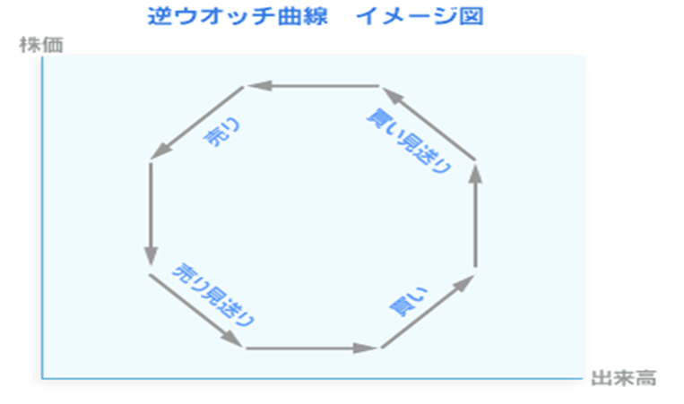
[Reverse watch curve]
If you draw a graph with trading volume on the horizontal axis and stock prices on the vertical axis, you can guess where the crossing points are based on the rule that a circle is drawn counterclockwise as time passes.In terms of clock hands,Buy at 3:9, sell at XNUMX:XNUMX".
[Volume ratio]
It looks at the volume and price rises and falls to determine if the current stock position is overbought.There are various calculation methods, but (1) (total trading volume on rising day + total trading volume unchanged from the previous day x 1/2) ÷ total trading volume x 100 (2) (total trading volume on rising day + previous day's trading volume) (total trading volume unchanged from the previous day x 1/2) ÷ (total trading volume on the day of decline + total trading volume unchanged from the previous day x 1/2) x 100, etc. With (1), 70% or more Overbought and less than 30% oversold. (2) is overbought above 450% and oversold below 70%.
[Wako volume ratio]
A trading volume indicator developed by technical analyst Yukiharu Abe when he was working at Wako Securities (currently Mizuho Securities).It divides the price movement into four phases: "increase in divergent energy", "decrease in divergent energy", "increase in livestock energy", and "decline in livestock energy". The point of change is the end of the downtrend or the turn to the uptrend, and the point of change from the increase of divergent energy to the decline is the end of the uptrend or the turn to the downtrend.
In order to create indicators based on these ideas, it may be necessary to collect and aggregate detailed parameters.
[Reverse watch curve], as long as I read the text, I feel like it makes sense.
3.Temporary provisional
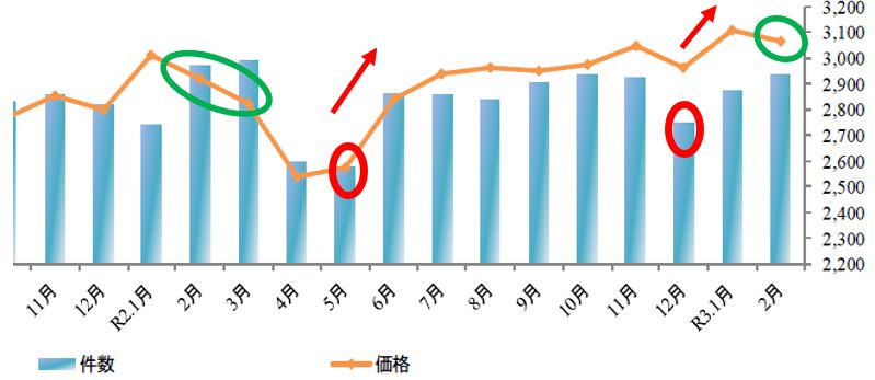
The graph shown in XNUMX above is shown again.
In the graph above, the number of red circles in May and December of the same year (trading volume in terms of stock investment) is circled in red.In both cases, it can be seen that when the number of cases increases in the next month, the price also rises at the same time.
However, in the case of January 2, it is interesting to note that although the number of cases increased the following month, the prices tended to decrease in February and March. (Midorimaru in the graph) Similarly, in February 1, the number of cases increased, but the price decreased (pun?).In regards to this, did you reduce the price and increase the number of cases in preparation for the March accounting period?I made a hypothesis.
Afterword
If charts related to real estate prices could be made as precise as stock investment charts, I think it would be helpful for price prediction.However, in terms of immediacy, the tabulation of contract data may become a bottleneck.
<end>